


Redesigning a website sounds simple enough. Until you start asking what the website should actually say about your company.
When we first set out to redesign Hipe’s website, the goal seemed straightforward: give our online presence a much-needed refresh. A cleaner interface, a more modern look, and a better way to introduce what we do.
But once we started exploring the design, one decision kept leading to another. A new website raised questions about our logo. A new logo introduced different ideas about our visual identity. Before long, we were experimenting with everything from typography and color palettes to illustrations and a rather round cat.
What started as a website project had quietly become a rebrand.
And while the finished website looks different from where we began, the more interesting part is everything that happened between the first concept and the final design.
Why we needed a Refresh
Our previous website had served as Hipe’s digital home for years. It introduced our company, explained our services, and gave visitors a way to reach us. But over time, we began to feel that it no longer represented Hipe as clearly as it could.
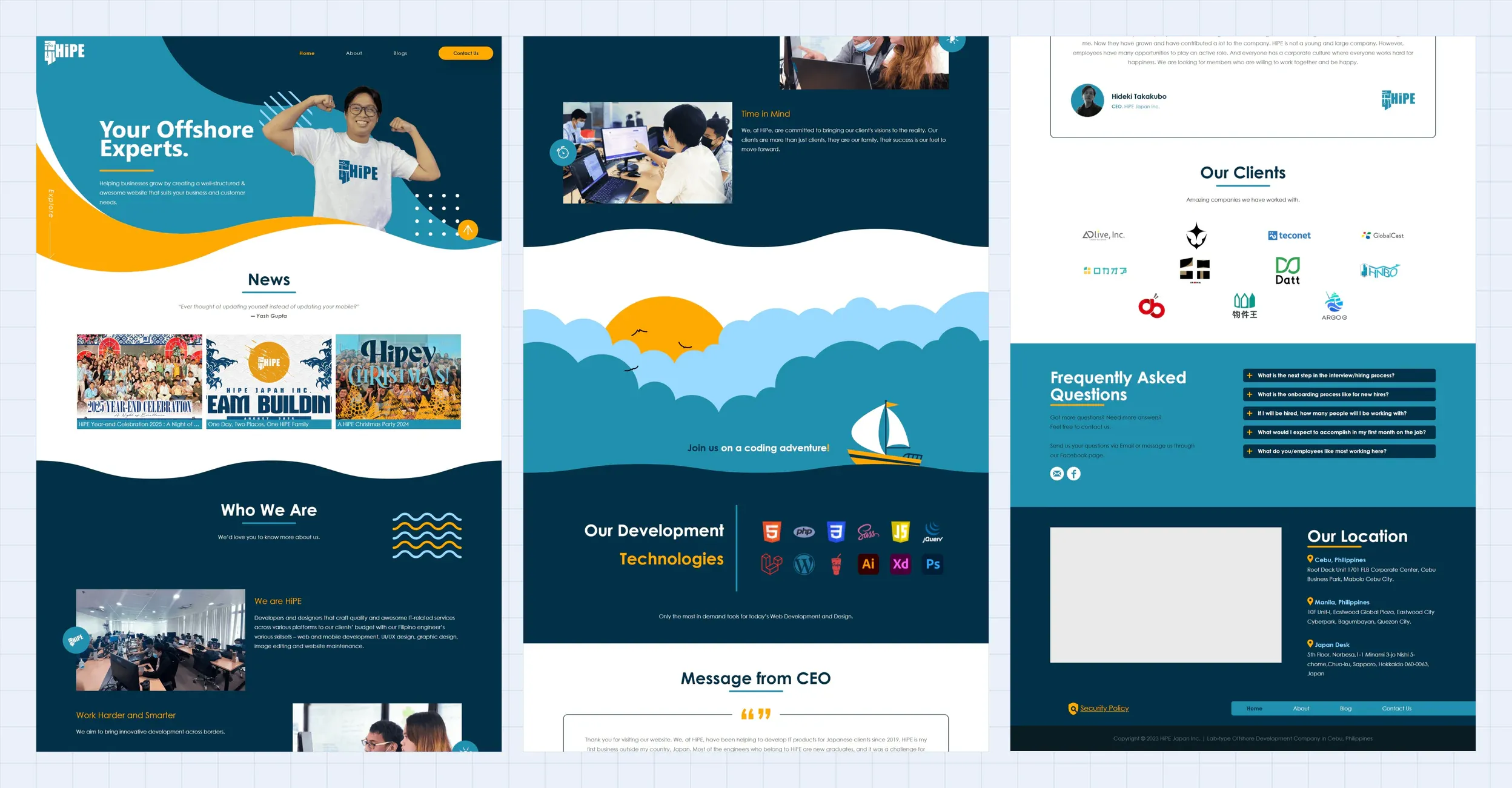
We build custom software, develop AI solutions, provide dedicated development teams, and support businesses as their technology evolves. Those services are important, but a list of capabilities doesn’t necessarily explain what working with us looks like.
We wanted visitors to understand the people and thinking behind the work, too. How do we approach a problem? What happens between an initial idea and a finished product? And how can someone tell whether we’re the right team to help them build it?
Those questions shaped the direction of the redesign. The website needed to be easier to explore, clearer about our capabilities, and more representative of Hipe today.
There was one complication: we didn’t want to throw away everything that made Hipe recognizable.
What makes Hipe, Hipe
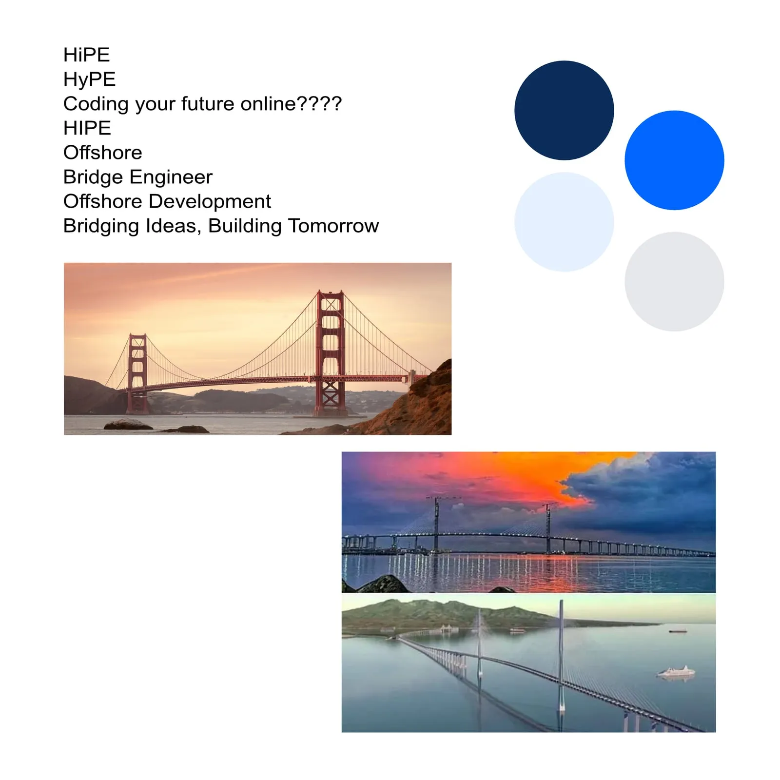
Before we could settle on a new website design, we started exploring the identity behind it. That brought us to the logo. At first glance, choosing a logo might seem like a relatively small decision compared with rebuilding an entire website. In practice, it influences almost everything around it: the visual language, typography, colors, illustrations, and even how the interface feels.
We explored two concepts that approached the same idea—connection—from different directions. The first connected the letters H and P through a shared geometric form. Its purple color direction gave it a more contemporary, premium character, while the linked letterforms represented relationships and collaboration.
The second incorporated a bridge into the letter H. Instead of expressing connection through abstract geometry, it used a recognizable symbol. A bridge brings separate places together, which made it a fitting representation of the relationships Hipe builds through technology.
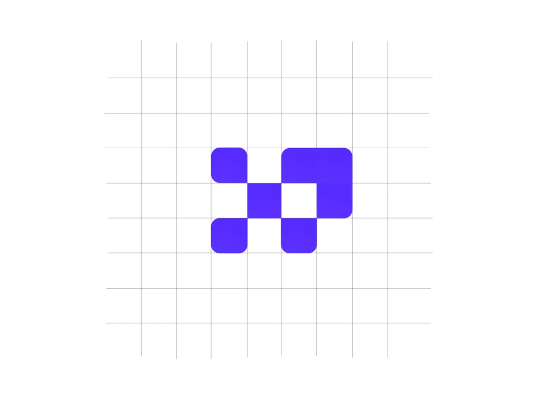
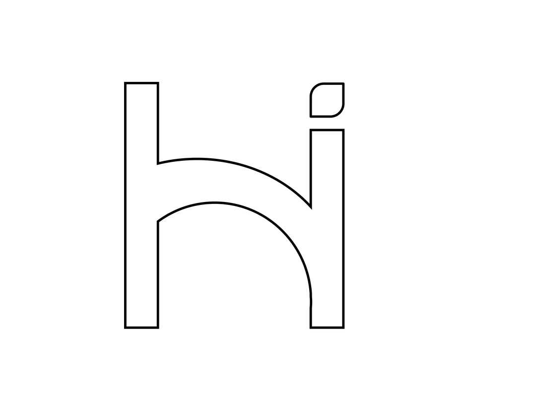
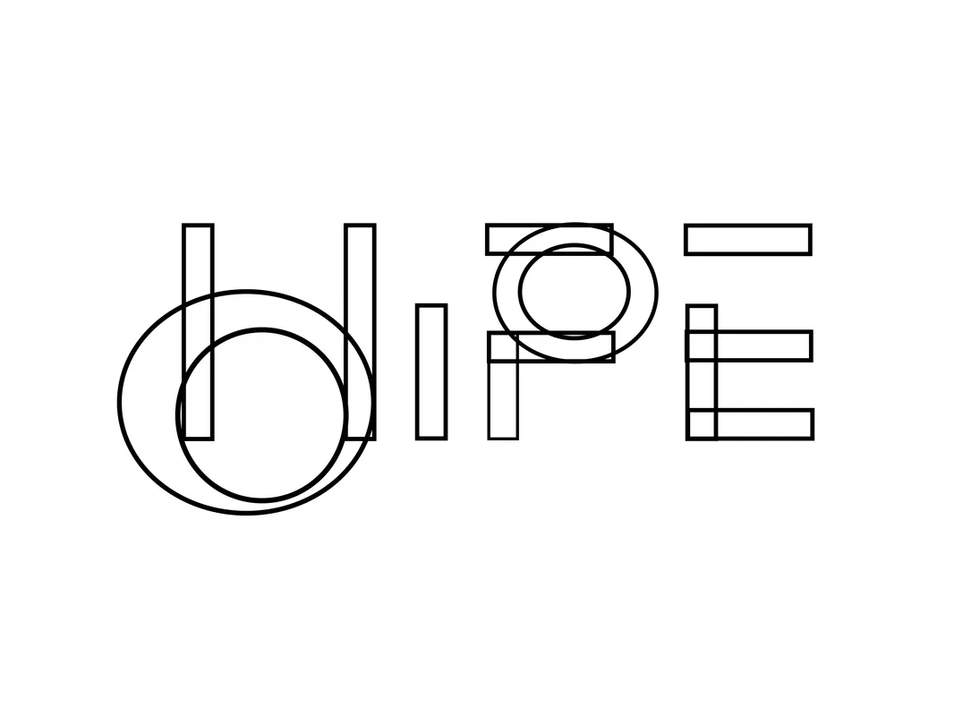
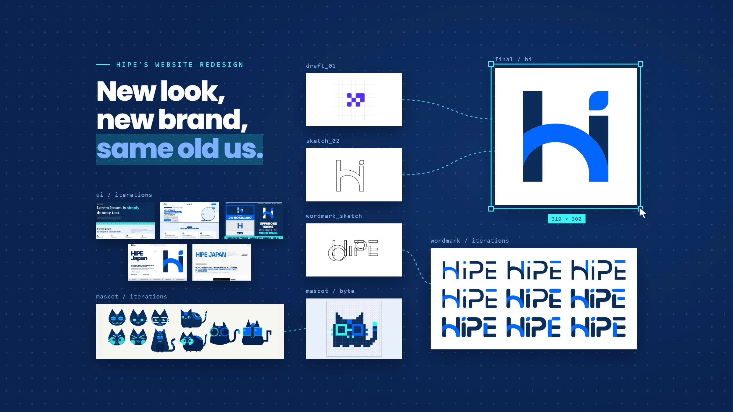
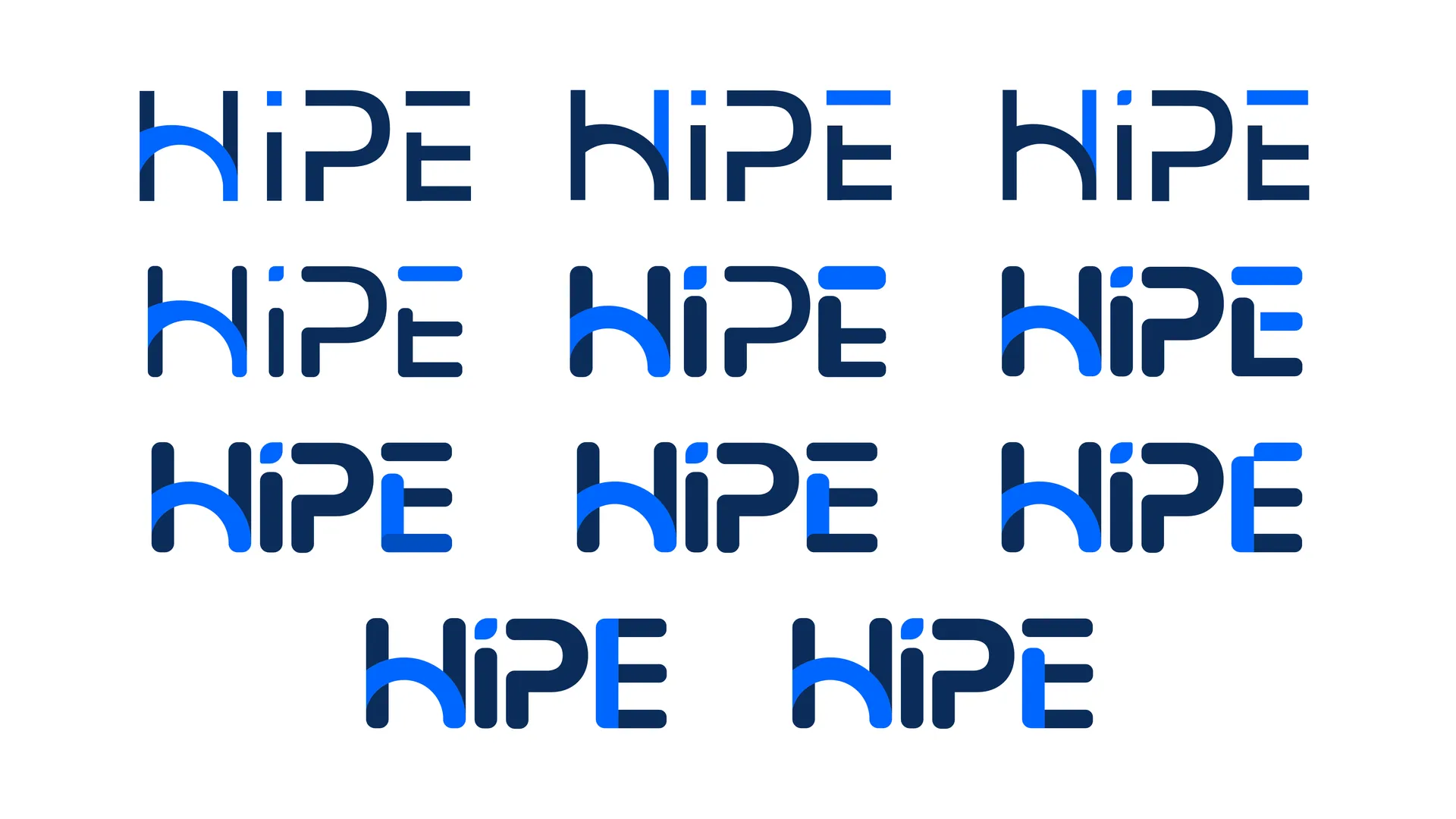
Choosing the bridge-inspired concept was one thing. Figuring out how the final logo should look was another. Before settling on the design, we went through several iterations, starting with the wordmark. We experimented with different lettering styles and even tried giving the letter e a little extra personality to make the name pop. Some variations were subtle, while others were more playful, but none quite felt right for the identity we were building.
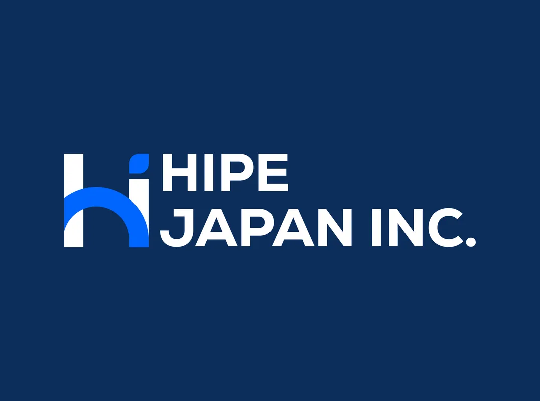
So we revisited the simpler approach: letting the H and P logo concept stand on its own. Rather than forcing extra details into the lettering, we focused on refining the symbol and how it would work alongside the company name. We chose Nexa for the wordmark, giving the typography a clean, consistent appearance that complemented the logo.
We also considered how the identity would translate into smaller formats, particularly the favicon. At such a small size, even the simplest details can make a difference, so we explored variations that would keep the symbol recognizable in a browser tab.
For the website itself, we created logo variations designed to work with both light and dark backgrounds. These include the standalone symbol and the full logo paired with the Hipe wordmark, allowing us to use the appropriate version depending on where it appears on the website. The result is a flexible identity that stays consistent across different layouts and visual themes.
Same Brief, Different Vision
Here’s something we learned early in the process: giving designers the same logo and brand colors doesn’t mean they’ll imagine the same website.
Two designers developed two notably different directions, each with its own interpretation of how Hipe should present itself.
The first explored an editorial approach inspired by digital magazines. The concept used prominent typography, structured layouts, and a more publication-like treatment of content. It showed how hierarchy and composition could give the website personality without relying on elaborate visual effects.
The second went in a more experimental direction, drawing from brutalist web design. Bold shapes, unconventional layouts, and stronger visual contrasts gave the concept a very different energy.
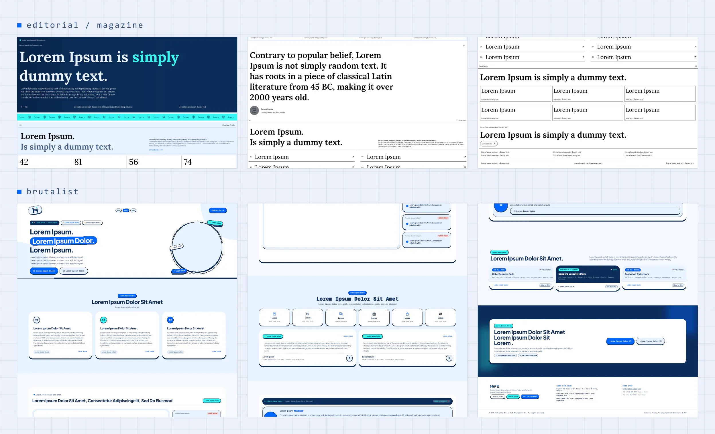
Side by side, the designs raised an interesting question. If both were interpretations of the same company, what made one direction more suitable than another?
The answer couldn’t simply be which looked more impressive in a screenshot.
We also needed to consider what visitors would be looking for, how the content would be organized, and whether the visual treatment helped people understand our services. A website can be memorable and still make important information difficult to find.
The two concepts gave us different things to learn from. The editorial direction highlighted the value of structure and readable content. The experimental direction encouraged us to think beyond familiar corporate layouts.
Neither exploration was wasted. They helped us examine the kind of experience we wanted to create before committing to a final direction.
Beyond the first draft
Design work rarely moves in a straight line from the first mockup to the final screen. Ours certainly didn’t.
We continued experimenting with layouts, visual treatments, and different ways to introduce Hipe. Each revision gave us another opportunity to look at the work as a visitor might, rather than only as the people designing it.
One of the recurring challenges was finding the right balance between personality and clarity.
We wanted the website to feel distinctive, but not at the expense of usability. We wanted visual details that made people curious, but we also needed visitors to find our services, understand our capabilities, and get in touch without unnecessary friction.
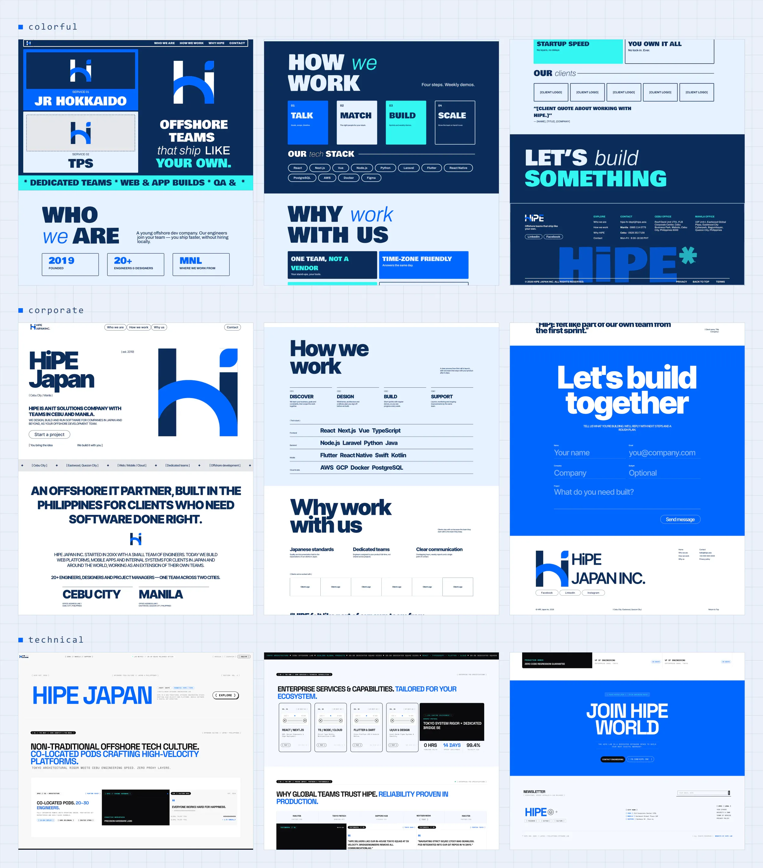
This is one of the reasons we value reviewing alternatives. A first concept gives you something to react to, but comparing multiple approaches makes it easier to explain what is working, what needs improvement, and why.
It’s a principle that applies well beyond website design. Whether you’re planning a new application, improving an existing platform, or exploring a custom software solution, the first idea is a starting point—not necessarily the answer.
Meet Byte, the Purrgrammer Cat
Not every part of a technology company’s identity needs to be serious. As the website evolved, we wanted to introduce a little more personality into Hipe’s visual identity. And what better way to do that than with a mascot?
But before Byte became the pixel-art cat you see today, we had a few other feline candidates. We experimented with different shapes and proportions, from a noticeably rounder cat to a slightly squarer version, trying to figure out which style would feel most at home on the website. Cute was definitely part of the brief, but we also wanted the character to complement the visual direction we were developing.
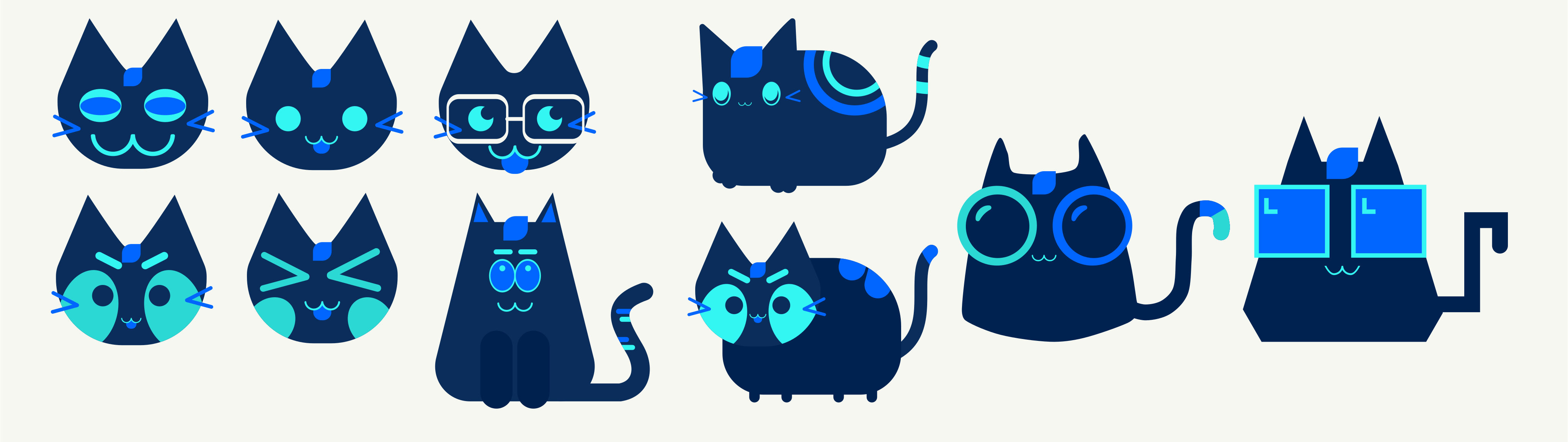
As the website design evolved, so did our ideas for the mascot. We eventually moved toward a pixel-art style, giving Byte a more distinct, retro-inspired personality that felt right for a technology company. With its blue color palette, expressive features, and playful appearance, the final design brings a friendly touch to Hipe without feeling out of place alongside the rest of the brand.
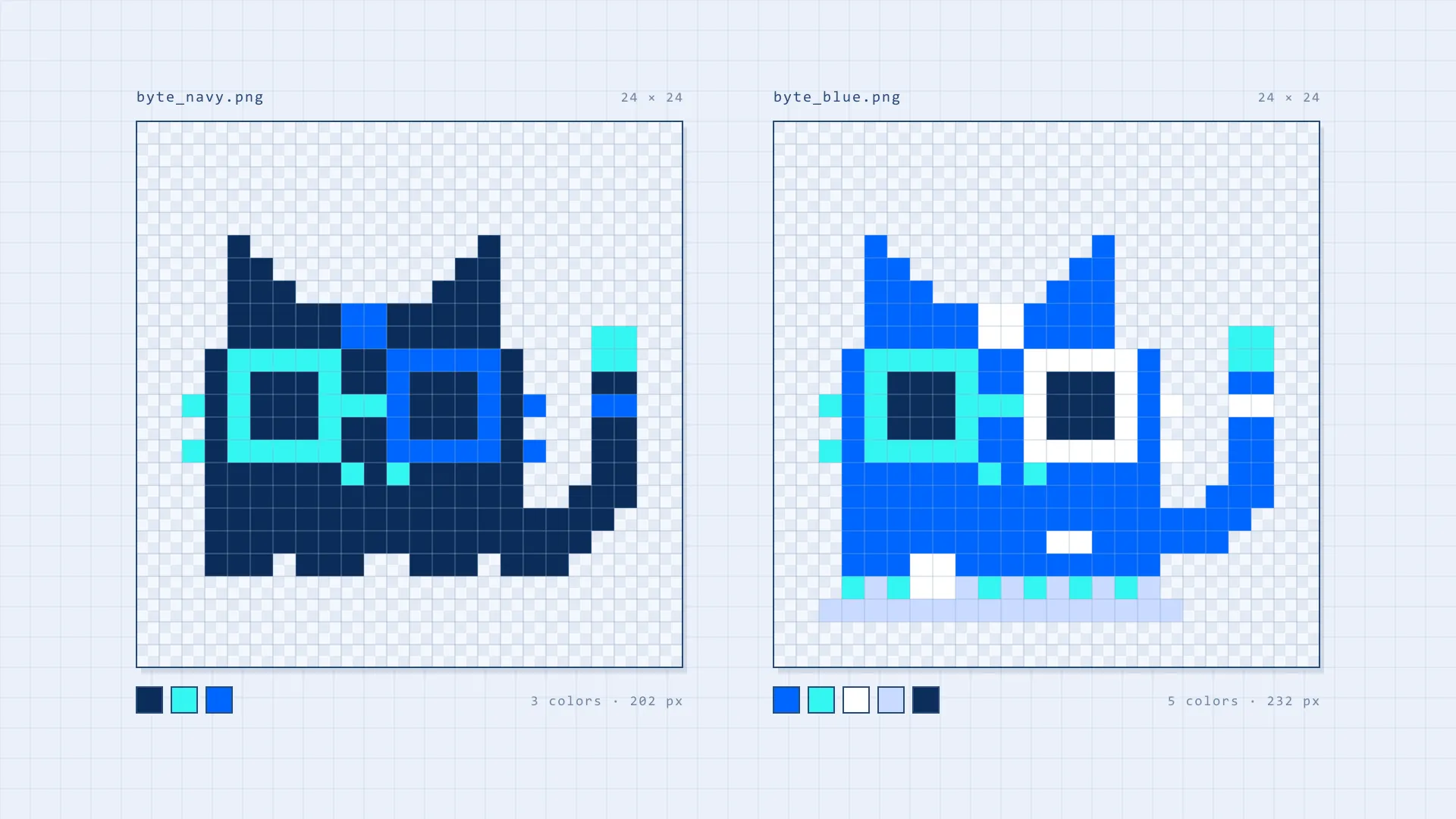
But Byte isn’t here just to look cute. A mascot gives us another way to make technical topics feel more approachable, whether it’s welcoming visitors to the website or adding personality to the content we share. And since we’re a technology company, we figured our new feline colleague deserved a job title.
Meet Byte, Hipe’s very own Purrgrammer Cat.
From Concept to Code
With the logo, colors, and overall direction taking shape, it was time to bring those ideas into the website itself. Remember the bridge in our logo? We wanted to give it a bigger role.
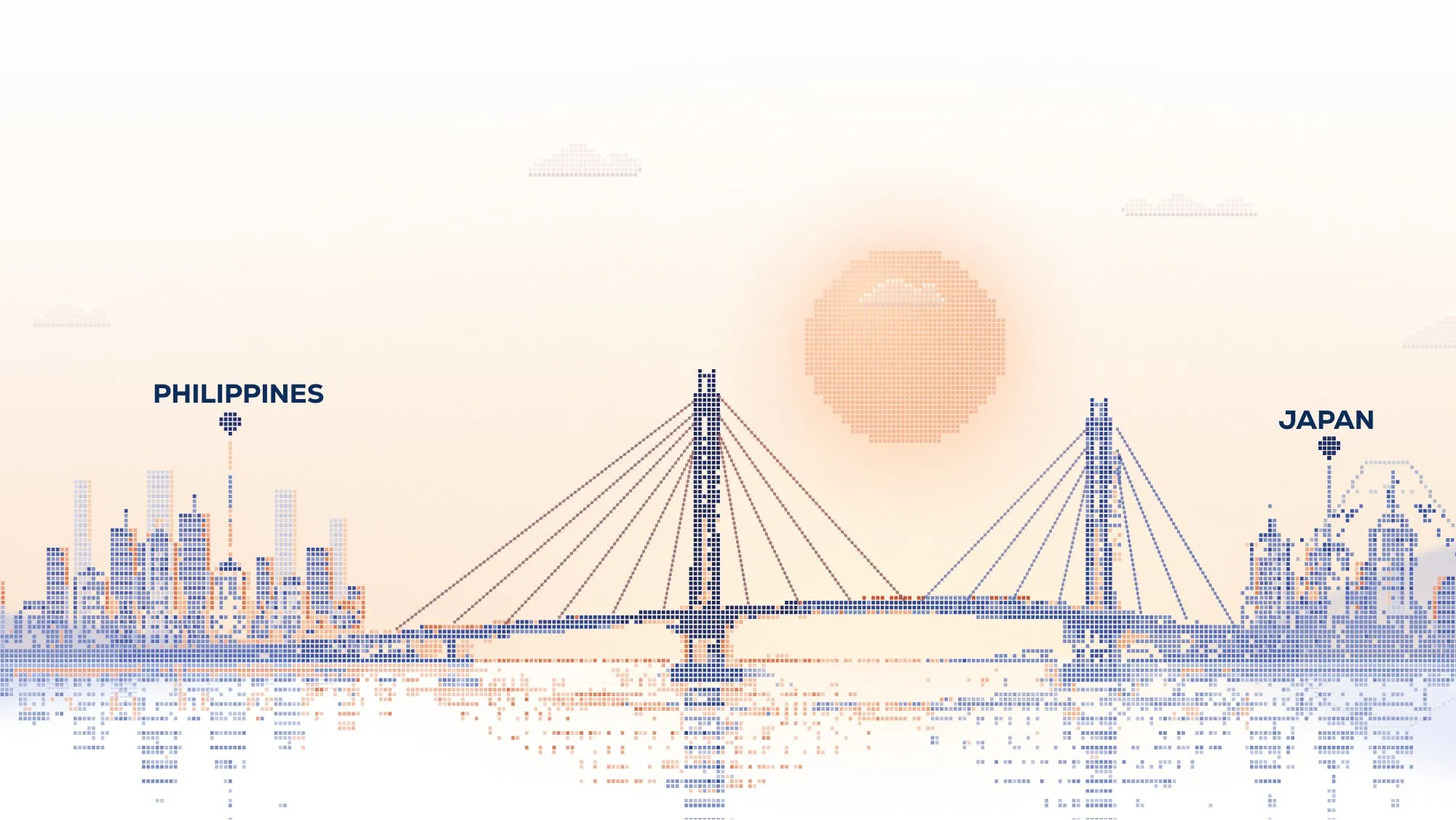
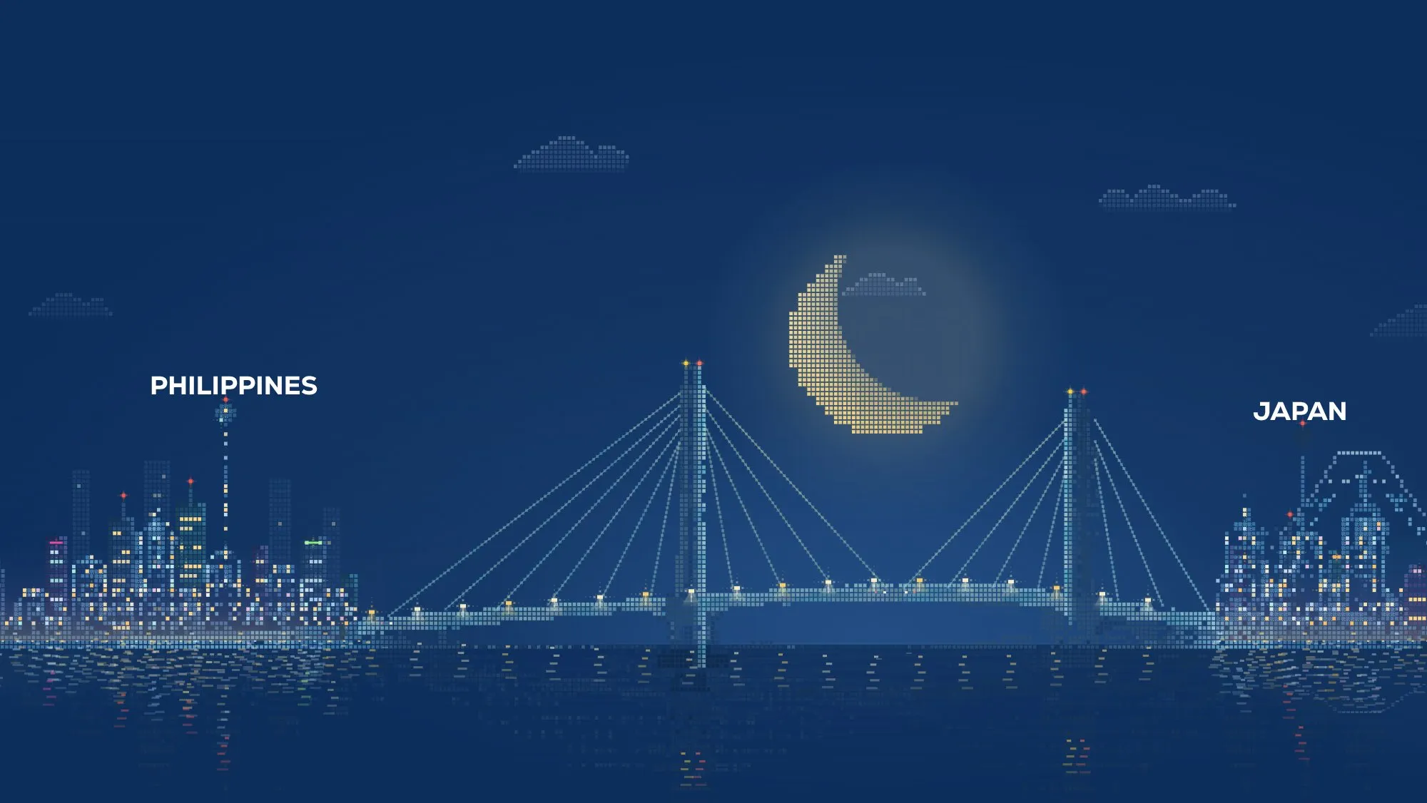
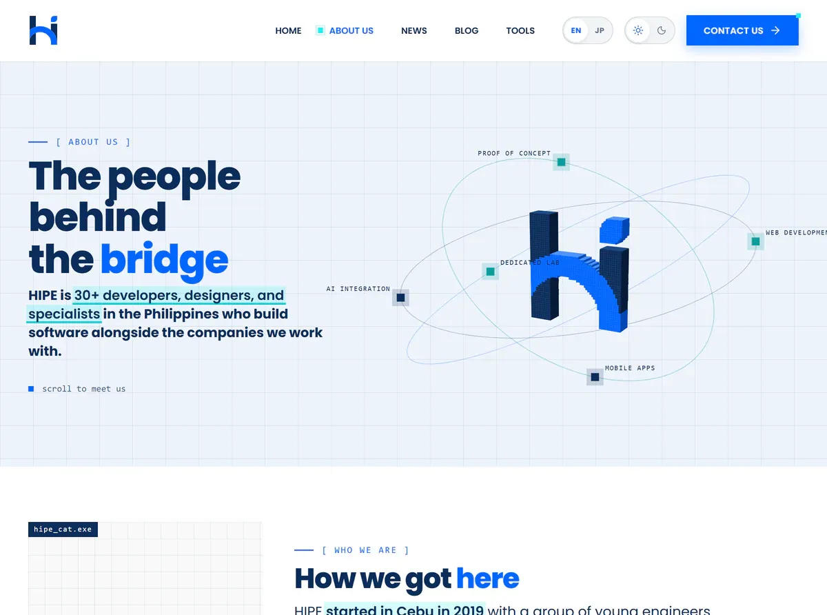
Instead of leaving it as a small symbol in the navigation bar, we used it as the inspiration for the homepage’s main illustration. The result was a landscape featuring a bridge, mountains, buildings, and water, bringing the brand’s visual identity into the first thing visitors see.
Of course, designing a detailed illustration is one thing. Making it work on an actual website is another. We built the artwork using HTML Canvas, separating elements such as the sky, mountains, bridge, and buildings into layers. This gave us more flexibility when adapting the illustration to different visual themes and screen sizes.
The website also needed to work beyond its desktop mockups. That meant considering how layouts would adapt to smaller screens, how typography would remain readable, and how visual details could support the experience without getting in the way.
For the website itself, we worked with Astro to bring the pages and components together. The goal was to turn the designs into a cohesive experience while keeping the content organized and the interface practical to use.
It’s easy to focus on how a website looks in a design file. But the real test comes when someone opens it in a browser, scrolls through the pages, and tries to find what they need.
That’s where design decisions meet development decisions, and where the details start to matter.
More Than a New Look
So, what actually changed? Quite a lot, visually. But we also wanted the website to do a better job of introducing Hipe and helping visitors find their way around.
The homepage now brings together the information we want people to discover first: what we do, the technologies we work with, our approach to development, and the businesses we’ve worked with.
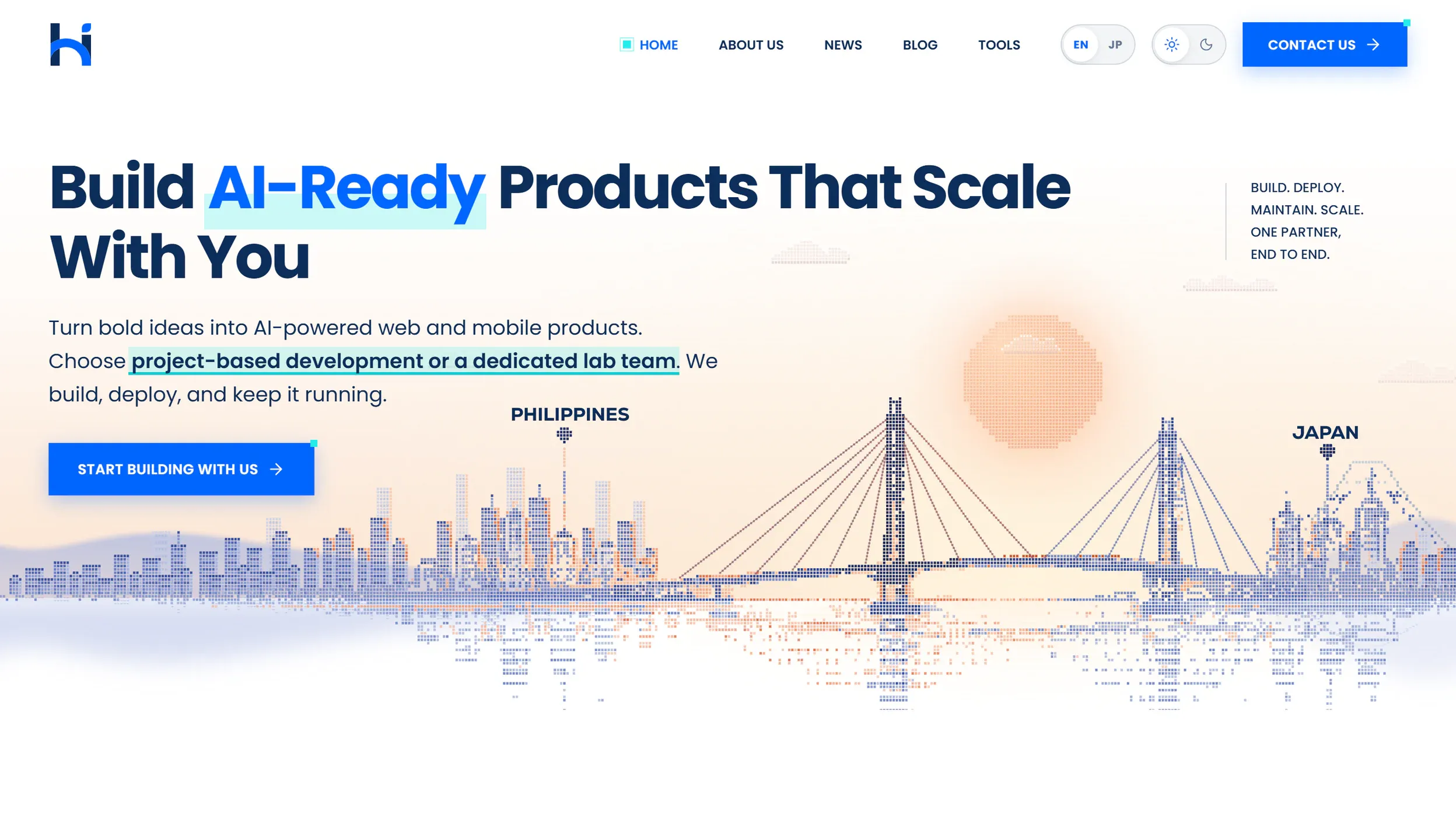
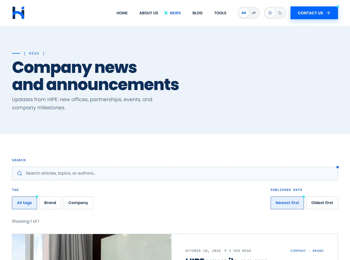
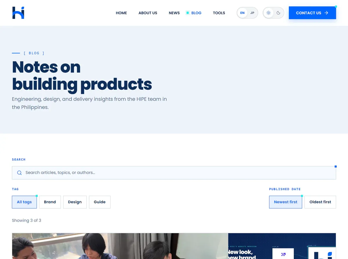
We also gave the rest of the website clearer roles. About Us introduces the company and the people behind the work. News provides a place for company updates, while Blog gives us room to share insights, experiences, and the occasional behind-the-scenes story—like this one.
We also introduced Tools, a space where visitors can explore useful resources and interactive experiences. And since Byte had already become part of the Hipe family, we figured the cat deserved more than a few appearances around the website.
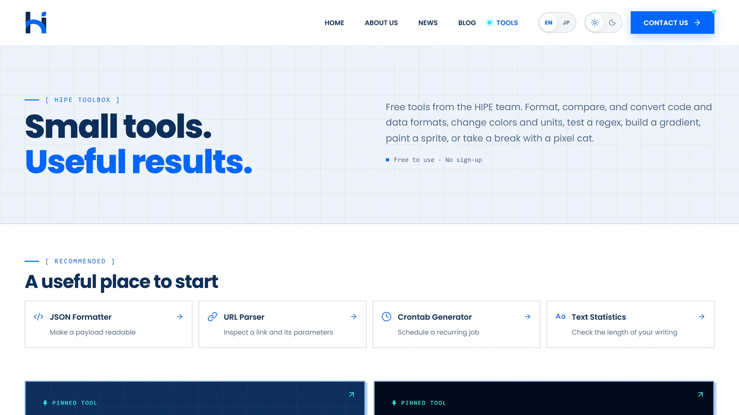
One of the features is Cat Portrait Lab, where visitors can customize their own pixel-art cat by experimenting with different appearances, outfits, and accessories. There’s also Sprite Painter, which brings another playful, creative experience into the mix. These tools give visitors something to interact with rather than simply read, while offering a small glimpse into the creative and technical possibilities behind the website.
And for anyone who wants to take the conversation beyond the screen, Contact Us provides a straightforward way to reach our team about a potential project.
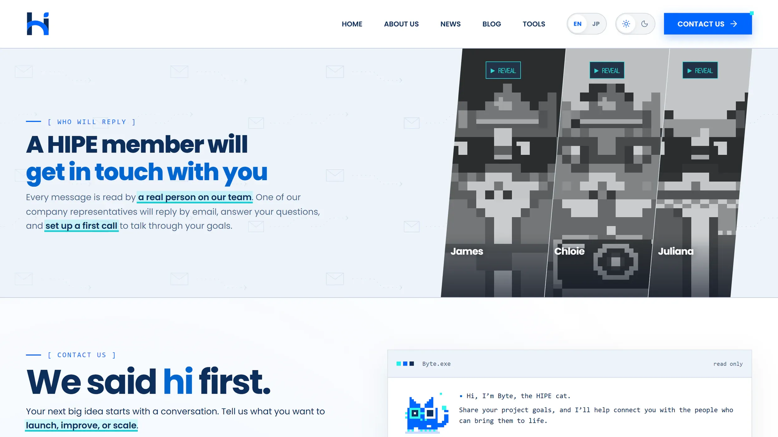
Rather than making every page compete for attention, we wanted each section to serve a purpose. Some introduce our capabilities. Others provide more context about the company. And some simply make it easier for people to take the next step.
For someone visiting Hipe for the first time, that matters more than any individual animation or illustration. A website should look good, certainly. But it should also help people understand what a company can do for them.
What’s changed (and What Hasn’t)
Looking back, it’s interesting how much of the website changed while the ideas behind Hipe stayed familiar. We have a new logo, a refreshed visual identity, different website layouts, and a pixel-art cat who now has a place in the company. But Hipe is still about the same things: building technology, working with people, and creating partnerships that help ideas move forward.
The redesign gave us a chance to express those values more clearly. It also gave us an opportunity to experience the same kind of creative and technical collaboration that goes into building digital products. We explored ideas, compared different approaches, refined the details, and worked through the process of bringing a concept to life. And while this particular project was our own website, the thinking behind it is relevant to the work we do with clients, too.
Whether we’re developing a website, creating a custom software solution, or supporting a business with a dedicated development team, understanding the goal comes first. From there, it’s about finding the right approach and building something that works for the people who will use it.
So, are we still the same Hipe? In the ways that matter most, yes. We just have a new way of saying hi.
What’s next
A new logo, a new website, and a pixel-art cat. Not a bad start, right?
But there’s more to Hipe than what you see on the screen. We’ll be sharing more of the projects we build, the ideas we explore, and the people who make it all happen.
And who knows? Maybe the next big idea we’ll bring to life will be yours.
Every project starts with a conversation. And sometimes, all it takes is a simple hi.